The Olympic Games are coming to London in 2012.
London is the capital city of the United Kingdom.
For £400,000, someone came up with a nice logo, which lots of
people don't seem to like very much.
It seems to me that a good logo should convey a strong sense of five
things:
- The Olympics
- London
- The United Kingdom
- The year 2012
- Sport
So I wondered what I could do in an hour that might give an idea of
what a good design might be. I'm not a graphic designer, so this
concept is a bit crude. Sorry.
Here's the clever bit.
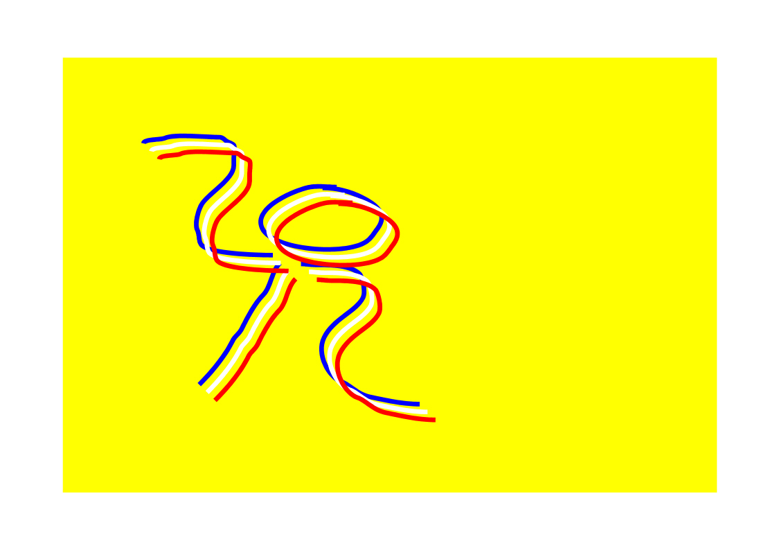
If you take the digits '2' '0' '1' '2' you can make quite a nice shape
that is both the number 2012 and a kind of human figure, perhaps a
runner waiting for the starter's pistol.

And if you have a few together, it could look like several runners
lining up at the start line, or racing for the finishing tape.

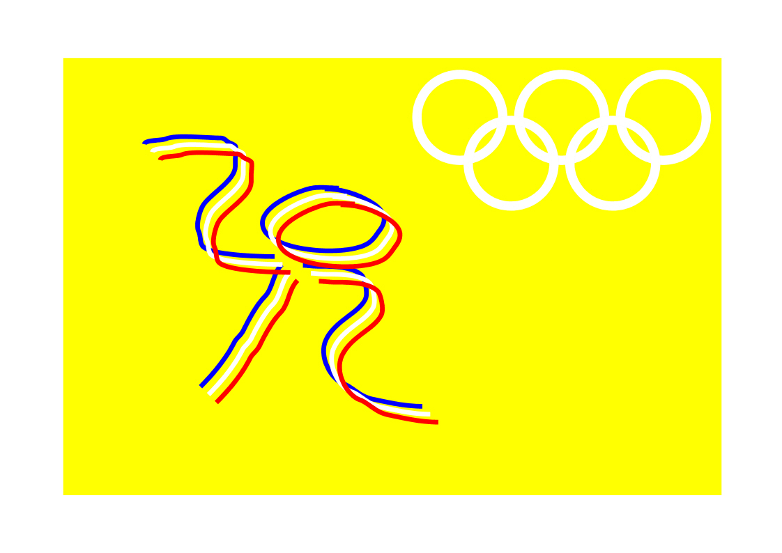
They're even red, white and blue suggesting the colours of the Union
Flag. Add in an Olympic logo and I think we are getting somewhere.

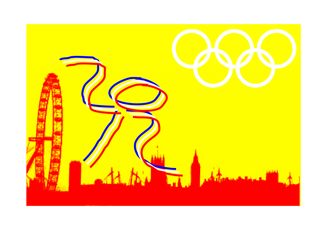
The tricky bit is London, but I think we might get away with just a
skyline featuring some recognisable buildings ancient and modern.

Now, I'm no graphic designer, and I can see that there's a lot wrong
here. The colours are iffy, and that pixellated skyline is
off. The 2012 is a scribble. It's a concept, but I like it
a lot better than the one that's been chosen.
I have an idea. I want to assert that this work is Copyright (C)
2007 J D A Parsons. I'd be happy to license it to the London
Olympic project for a suitable donation to an appropriate charity of my
choice - a small fraction of £400,000 would do the trick.
I'm sure a great graphic designer would take it on from here on a
similar basis.
What do you think? Please
vote!
If you like you can also send
me comments.
